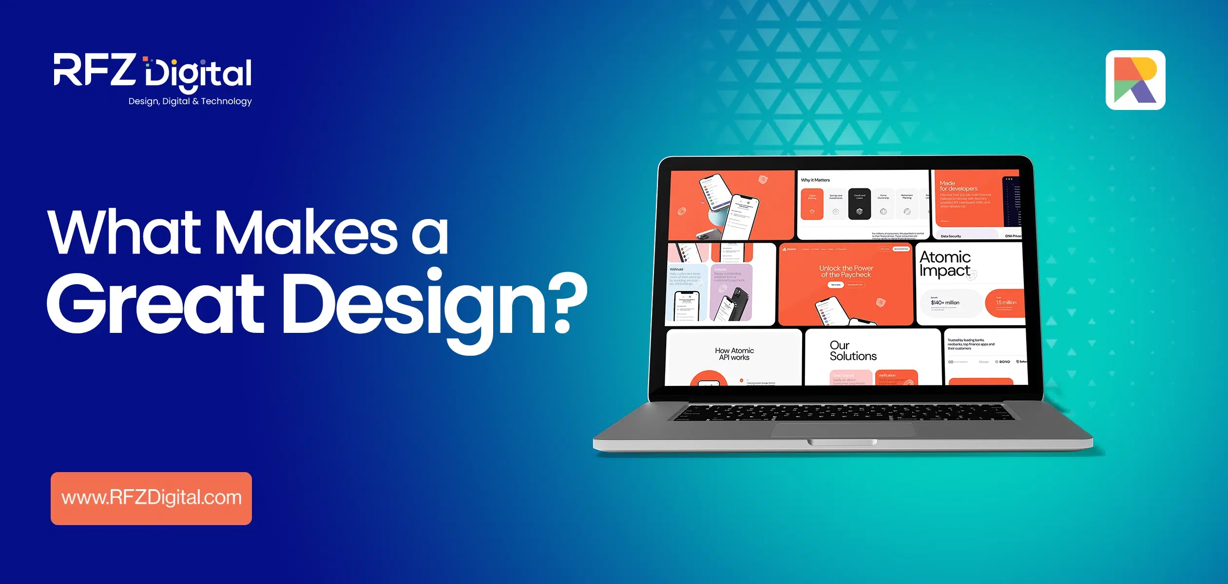
Design surrounds us, defines our brands, and influences how we interpret the world. It's in the curves of our cars, the layout of our office spaces, and the pixels on our screens. But what truly makes a great design? It's a question often oversimplified yet laden with intricate details that form the backbone of everything aesthetically pleasing. In this deep-dive exploration, we're peeling back the layers of design, from the unmistakable elements to the subtle guiding principles that together create harmonious visual narratives.
Understanding the Elements: Building Blocks of a Great Design
There is a science to the art of great design, and it starts with the elemental forces that govern every creation. Just as physics employs the periodic table, design has its own set of foundational elements that every designer uses to build their compositions. Line, color, texture, and more are the ABCs of the visual language, the raw materials that push and pull the eye through a design, where some are thrust into the limelight, and others play a supporting role.
Line: The Pathway to Direction:
Imagine a dot traversing a path. That's the role of a line in design: it guides, it connects, and it separates. It's the starting point for all visual communication. A single stroke can be menacing or inviting, sharp or soft, convey direction or motion, or lead the viewer's focus, determining the emotional response.
Color: The Emotional Chameleon of Design
Color is beyond aesthetics. it’s the emotional pulse of design. Whether you’re evoking calm with a pastel scheme or signalling danger with a bold red, colours command attention and anchor memories. They tie together a narrative, adding depth, contrast, and energy, setting a tone that resonates with audiences on a personal level.
Texture: Inviting the Sense of Touch
Design’s third dimension is often tactile. It’s texture that adds a layer of familiarity to the visual experience, not in the literal sense of touch, but in the subliminal nod to the world around us. Roughness, smoothness, burlap or satin, and texture add richness to the flat canvas and invite a sensory dimension to the design.
Direction: The Silent Storyteller
There’s an inherent desire for movement in design, a narrative progression, be it with the z-shaped reading pattern or a diagonal line representing dynamism. Directional cues are the unsung heroes of a composition, silently leading the eye from one visual landmark to the next, subtly communicating a story without a single word.
Size and Scale: Playing with Perception
In the universe of design, the size of an element is less about its dimensions and more about how it’s perceived. Scale plays with our expectations, creating drama and hierarchy. Think of an ant in your living room an element’s effect on a design changes dramatically as its scale shifts in relation to its environment, often the key to ensuring balance.
Shape: The Identity of Form
Shapes, like color, are deeply ingrained in the human psyche. Circles convey unity, squares represent stability, and triangles induce tension. They fill the void, expressing form, and can even be the very figures framing the content. More than mere edges, shapes tell a story within the design landscape.
Guidelines for Harmonious Compositions in Design:
In a world where the visual first impression can be the deciding factor in a customer’s engagement with your brand, understanding the principles of design becomes paramount. Design is no longer just about aesthetics. it’s a powerful tool that can convey messages, evoke emotions, and facilitate experiences. Whether you’re a seasoned professional or a budding artist, grasping the foundational principles of design is essential to creating captivating, effective, and functional designs.
But what are these principles of design, and how can you leverage them to produce work that stands out? In this comprehensive guide, we’ll explore the core principles of design and provide actionable insights to elevate your visual creations.
Once the elements are in place, it is the principles of design that transform a good composition into a breathtaking masterpiece. These are the cornerstones that every creator must understand; they are the logic behind the artist’s intuition, the reasoning in the face of inspiration.
The Core of What Makes Great Design: The Principles of Design
Every deliberate visual creation, from a simple webpage to a complex architecture, is a manifestation of the principles of design. The principles serve as a guideline to balance, organize, and create a unified structure within a work of art.
Understanding these principles will not only enhance your visual literacy but also ensure that your designs are solid and coherent. The six primary principles of a great design include:
Proximity:
The principle of proximity dictates that related elements should be placed close together. This closeness creates a visual connection, making it easier for the viewer to perceive relationships. In design, proximity helps to organize information and reduce clutter. A clean and coherent layout emerges as a byproduct, guiding the viewer’s eye intuitively from one element to the next.
Balance:
Balance is the equal distribution of visual weight in a design. There are several types of balance, including symmetrical (the visual elements on one side of the design are similar to the other side) and asymmetrical (different elements that have equal visual weight). Achieving balance is key to avoiding a design that feels off-kilter and unsettling. It provides harmony and stability, allowing the eye to move naturally throughout the design.
Alignment:
The principle of alignment relates to the arrangement of different elements within a great design. Proper alignment creates a logical flow and a connection between the elements, making the design feel ordered and purposeful. It also helps to guide the viewer’s eyes, emphasizing the most important parts of the layout.
Repetition:
Repetition involves the use of consistent, recurring elements within a great design. This can be in the form of shapes, colors, or fonts. It provides a sense of rhythm and unity, tying the various parts of the design together. Repetition can create visual interest and make a design more memorable.
Contrast:
Contrast is the difference between elements in a great design. It can be used to highlight key points, create a focal point, and add visual interest. A good use of contrast can make a design pop and attract attention. However, it should be utilized judiciously, as too much contrast can make a design look chaotic or hard to digest.
Space:
Space, often referred to as ‘negative space,’ is the area around or between elements in a great design. It’s not merely the background but an active element that helps to create a flow and emphasize the positive space. A well-considered use of space can enhance legibility, improve the balance of a design, and provide rest for the eyes.
Rhythm:
Rhythm is the undulation of the eyes across the canvas; it is the repetition and variation of elements that lead to a cohesive flow. Just as in music, there’s a visual beat in well-designed pieces, with elements echoing and ranging in a manner that’s both predictable and dynamic.
Proportion:
Proportion is about relativity and the golden ratio. It’s about ensuring that one element isn’t overpowering in its scale compared to others, maintaining visual harmony. Often, it’s used to ensure that the most crucial elements have appropriate emphasis, never overshadowing the rest of the composition.
Unity/Gestalt:
Unity is the principle that transforms discrete elements into a singular, powerful whole. Even when each part is beautiful in its own right, it’s the unity that makes them resonate together. The Gestalt principle embodies this, stating that the human eye seeks completeness, organization, and order in what it perceives making the final composition unified and complete is where the true art lies.
Case Studies: Applying Theory to Real Design Challenges
We’ve spent time dissecting the theory, but how does it apply in the real world? Here, we look at the practical applications of design theory through case studies, seeing how the mastery of elements and principles creates tangible, successful outcomes.
E-Commerce Redesign: A Facelift for User Experience
Imagine the task of redesigning an e-commerce page to improve sales. Color theory dictates more calming hues to soothe shoppers; textural elements could offer a sensory dimension to the online experience; directional cues might guide the busy eye to the “Buy Now” button seamlessly. Each choice is deliberate, leveraging design to enhance functionality and aesthetics, all on a perfect scale.
Branding Overhaul: Capturing the Essence of a Company
A brand’s story is often told through logos and asset design like: design posters, flyers, and banners. Here, the shape takes the forefront, representing the ethos of the brand. Is it a corporate triangle suggesting upward growth? A circle portraying community and completeness? Color becomes synonymous with the brand identity, while proportion and balance ensure that the brand’s message is always loud and clear.
Evolving with Design Trends: Staying Aligned with Ever-Changing Styles
The world of design never sits still it’s in a perpetual dance with innovation and trends. It’s vital to be attuned to these shifts, the pendulum that swings between minimalism and maximalism, the monochromatic cool, and the rainbow riot of color. Designers must be adaptable, learning from the past while innovating for the future.
Design for a Digital Age: A New Canvas
The move to a predominantly digital environment has greatly impacted design. We see now more emphasis on interaction, with elements needing to not only look good but also respond. Motion graphics and interactive design challenge traditional thinking, obliging designers to reimagine the elements and principles’ application in a constantly evolving space.
Sustainability in a Great Design: The Ethical Element
A new rising star is sustainability, a principle seeping into the very elements of a great design. Textures might now emulate those of recyclable materials; colors are born from organic dyes and prints. The principles themselves are questioned: is this design not only beautiful but also responsible?
Pursuing Good Design to Produce Great Results
Good design is not just about following the principles; it’s about the process, the decisions, and ultimately the results. Here are key steps to pursue to ensure your design delivers:
Strive for Innovation:
Innovation in design arises from a combination of creativity and problem-solving. It involves thinking outside the box, trying new approaches, and pushing the boundaries of what’s considered conventional.
Strive to be inventive and original in your design process. This could mean experimenting with new technologies, exploring unique visual styles, or reimagining common design practices.
Go for Good Looks and Sensations:
Visual appeal is a significant component of a great design. A visually striking design can capture attention and leave a lasting impression. However, good design goes beyond looks consider the tactile and emotional aspects. Ensure that your design not only looks good on the screen or paper but also feels good to interact with and elicits the emotions you intend to convey.
Make Your Design Speak Clearly:
Clarity is essential in a great design. A clear design communicates its message effectively without leaving room for misinterpretation. To achieve clarity, simplify your designs, focus on your core message, and ensure that every design element serves a purpose.
Make It Unobtrusive:
Good design should complement the content without overwhelming it. The design should create an enjoyable experience for the viewer without drawing unnecessary attention away from the main message. It’s important to ensure the design doesn’t overshadow the content.
Keep It Honest and Upfront:
Your design should reflect your brand’s identity and values truthfully. Honesty in design means you’re not tricking users with misleading visuals. Your design must be a genuine representation of your business.
Keep Unfashionably In Style:
Fads come and go, but timeless design remains stylish year after year. While it’s valuable to be aware of current design trends, it’s more important to create designs that will stand the test of time. This will not only prevent your work from quickly becoming outdated but also contribute to the longevity of your brand’s visual identity.
The Power of Whitespace:
Whitespace is the unsung hero of a great design. It allows a design to breathe, emphasizes important elements, and contributes to an overall sense of elegance. Don’t underestimate the value of whitespace in enhancing the legibility and attractiveness of your designs.
Details Matter:
The devil is, indeed, in the details. Small, often overlooked elements such as line thickness, kerning, and color shades can dramatically affect the perceived quality of your design. Paying attention to these details is critical in professional design.
Conserving the Environment:
Sustainability is increasingly becoming a concern in the design industry. As a designer, you have a responsibility to reduce your carbon footprint and minimize waste. Consider the environmental impact of your design choices, from the materials you use to the processes you implement.
Less Is Often More:
The minimalist approach to a great design has gained popularity for good reason. Simple, uncluttered designs are more digestible and memorable. Strive for simplicity in your designs, aiming to convey the maximum effect with the minimum means.
Conclusion:
In conclusion, the strata of design are complex, yet within this rich tapestry, a clear picture emerges: what makes a great design is not just its aesthetic pleasure but its successful implementation of the raw elements and guiding principles that make it both meaningful and memorable. The contours and colors resonate within the human spirit and guide us through the curated experience of design. As we continue to push the boundaries of creativity and technology, the dialogue between theory and practice will be forever alive, informing and enriching the visual landscape around us.
Mastering the principles of what makes a great design is a continuous process, an ongoing refinement of your craft that demands practice, patience, and a keen eye for detail. By understanding these principles and embracing the pursuit of good design, you can create art that not only reflects your talent and creativity but also resonates deeply with your audience.
Design is more than just aesthetics; it is a language that speaks volumes about your brand. Choose to speak with eloquence, and the rest will follow. For design solutions that encapsulate the essence of your brand, reach out to RFZ Digital. As industry leaders in design services, we are committed to turning your vision into a masterpiece. Contact us today and start the conversation about how we can enhance your brand through design.
Frequently asked questions
There are certain qualities or fundamental principles that can be applied to create good design, regardless of the design-related field you are in. These principles are as follows:
1. Simplicity: In good design, less is often more. Simplicity can help to convey your message clearly and effectively.
2. Innovation: A good design is innovative and creative. It should stand out from the crowd and offer something new and exciting.
3. Intuitiveness: A good design should be easy to use and understand. The user should be able to navigate through the design without any difficulty.
4. Visual beauty: A good design should be visually appealing. It should catch the user’s attention and be aesthetically pleasing.
5. Honesty: A good design should be honest and transparent. It should accurately represent the product or service it is advertising.
 0
0


Comments:
No comments yet. Be the first to comment!